(University Project)
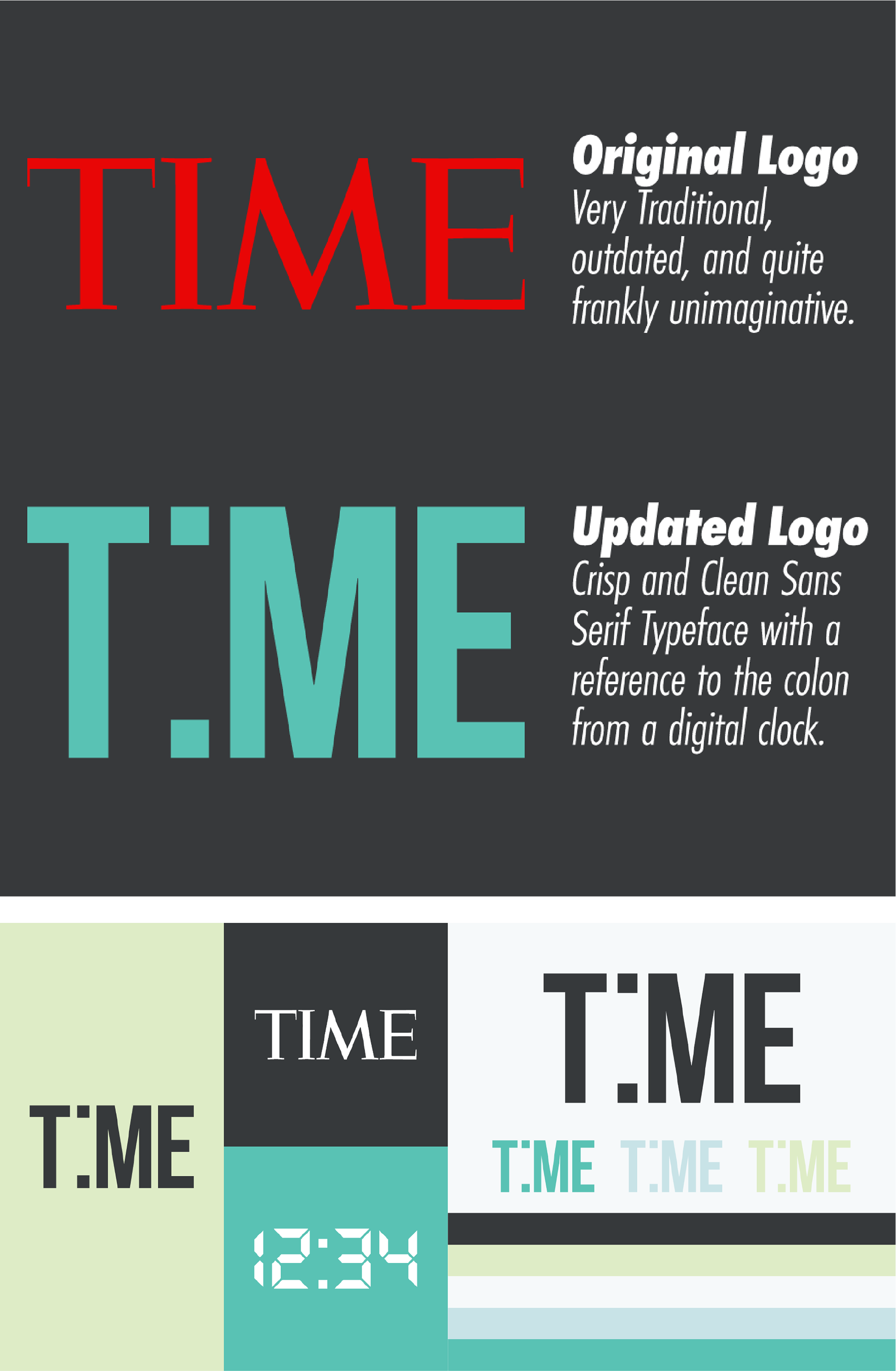
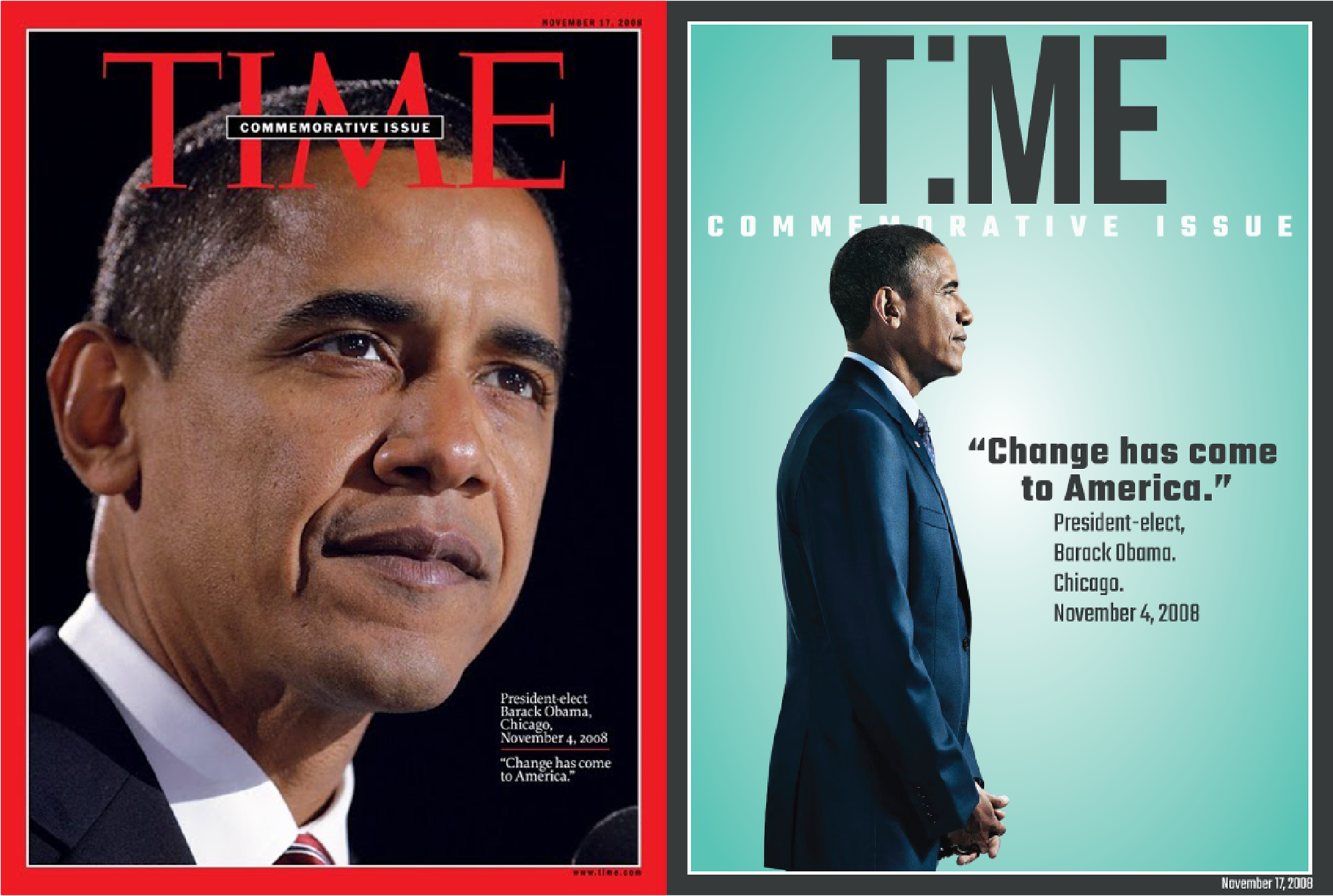
For this project we were tasked with choosing a magazine that we believed needed a rebrand for whatever reason. I chose Time Magazine because I have always felt it was an outdated and not very appealing design and identity as a whole. My goal was to modernize the look and turn it into a brand a buyer would be drawn to pull off the shelves.

Color Reasoning
This brand was created to compete with the more trendy & easily accessible CBD vape lines that have recently come into the market. These brands are closely related to the bright & “street” style vape companies that target a younger market. We decided to choose rich and bright colors that really catch the eye and draw the customer to the packaging.