Summary
RE/MAX Precision embarked on a strategic branding initiative with the dual purpose of distinguishing their visual identity from competitors in the market while also positioning themselves as a premier, elevated option within the real estate landscape. Our primary goal was to communicate that RE/MAX Precision exuded a level of prestige and excellence beyond other brokerages in the area.
Key Objectives:
Differentiation: Develop a visual identity that sets RE/MAX Precision apart from competitors, ensuring that it stands out in a crowded marketplace.
Elevation of Perception: Convey through design elements and messaging that RE/MAX Precision embodies a higher standard of service and professionalism compared to other brokerages in the region.
Prestige Enhancement: Enhance the perception of RE/MAX Precision's prestige, positioning the brand as the preferred choice for clients seeking unparalleled service and expertise in the real estate sector.
Market Leadership: Establish RE/MAX Precision as a leader in the Des Moines real estate market, known for its distinctive brand identity and commitment to excellence.
Through a strategic blend of design elements and messaging, our objective was to visually communicate RE/MAX Precision's superiority and prestige, solidifying their position as the premier choice for discerning clients in the area.
A look at the competitors
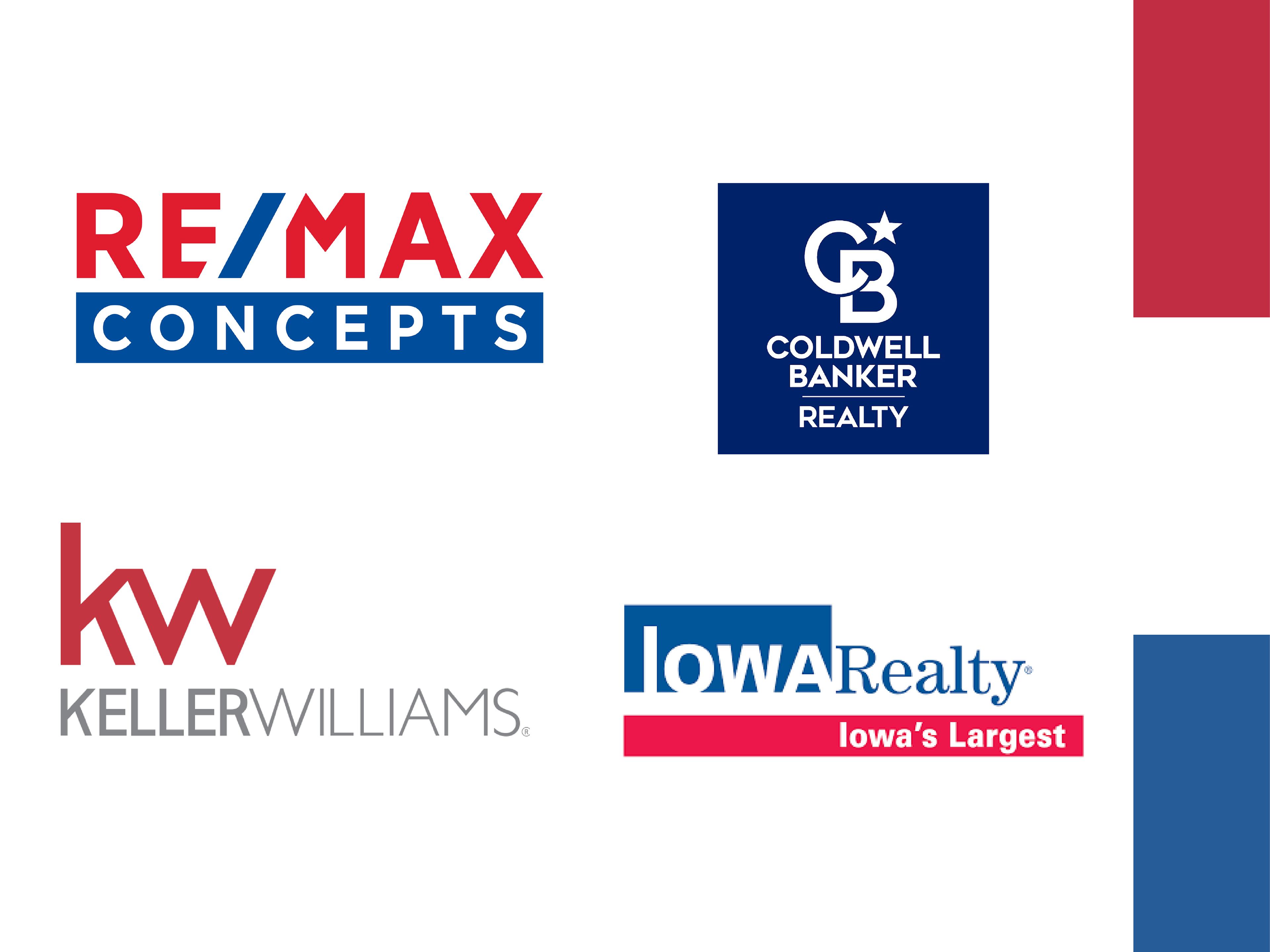
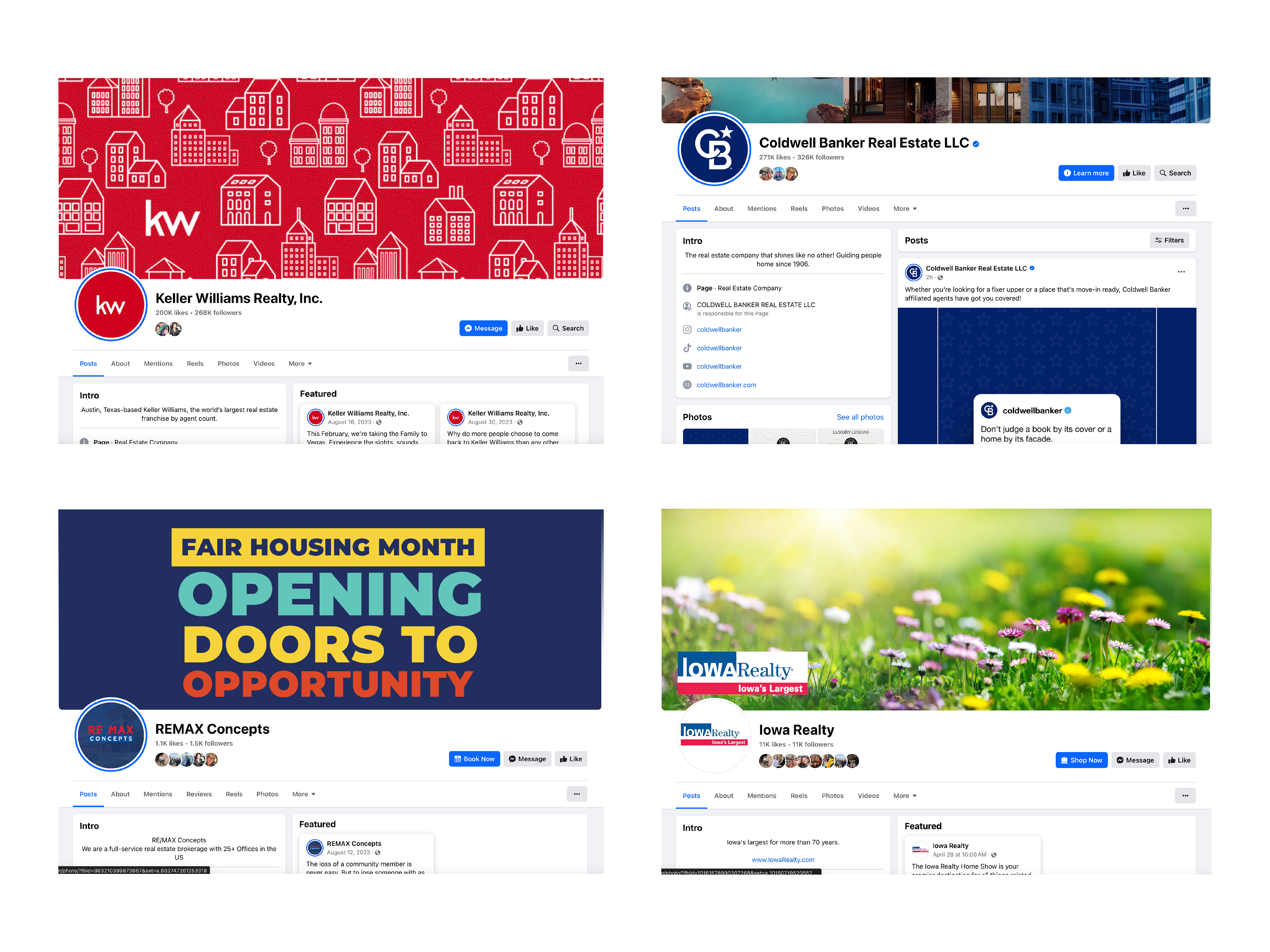
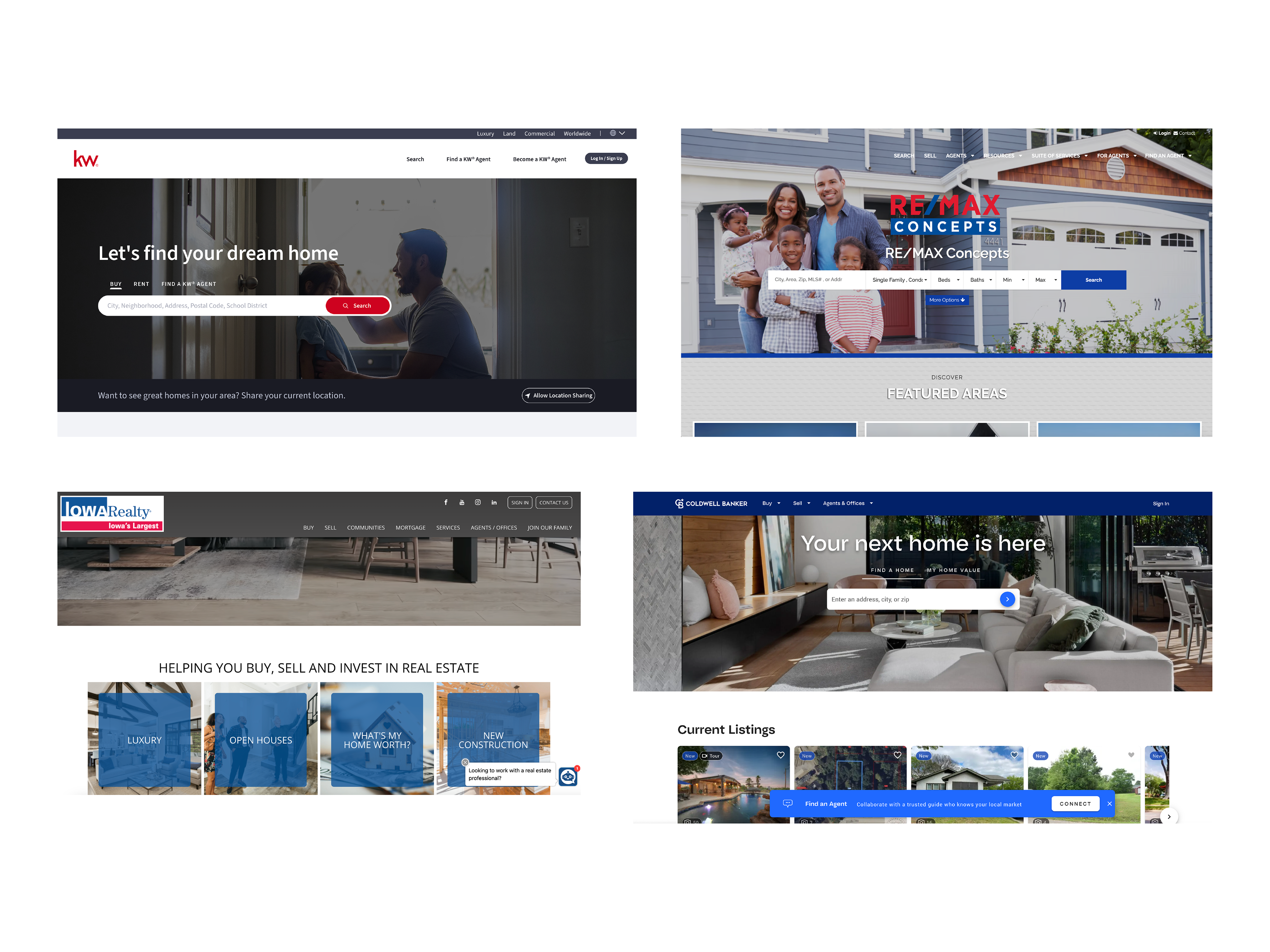
Upon reviewing the branding practices of leading brokerages in the area, it was evident that many relied on a conventional red, white, and blue color scheme and sans-serif typefaces. However, discussions with the owner revealed a desire for RE/MAX Precision to transcend industry norms and embody prestige and luxury in the real estate market. To achieve this, an analysis of luxury brand logos was conducted, indicating a consistent use of serif typefaces to convey tradition and refinement. This insight led to the decision to adopt a serif typeface for Precision, aiming to evoke exclusivity and elegance. Market research further identified key attributes associated with luxury brands, guiding the development of a brand strategy focused on timeless aesthetics and attention to detail. Through meticulous research and analysis, we crafted a unique visual identity positioning RE/MAX Precision as a symbol of luxury and excellence in Des Moines real estate.
Color rationale
As an industry frontrunner in Real Estate, RE/MAX Precision naturally garners significant attention. Seeking to distinguish itself amidst a sea of red, white, and blue Real Estate logos, Precision opted for a distinctive approach. A greyscale color palette complemented by a subtle pale yellow accent was carefully selected to cultivate a sleek, professional aesthetic, ensuring Precision's visual identity stands out with clarity and sophistication.
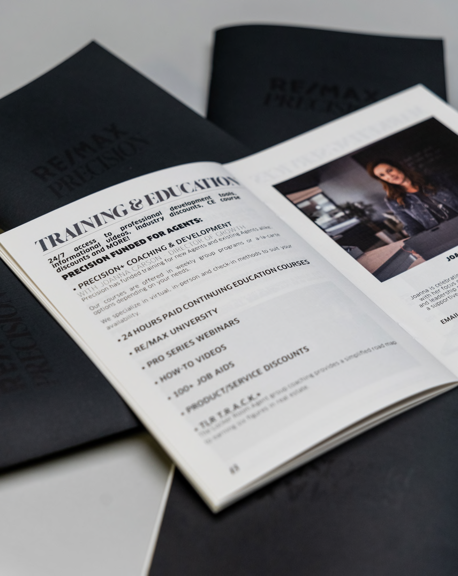
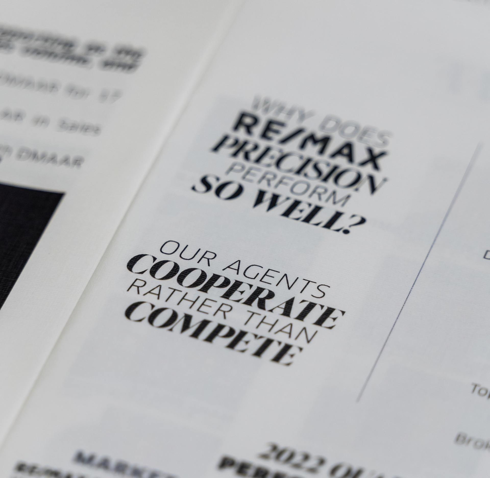
Recruitment Booklet
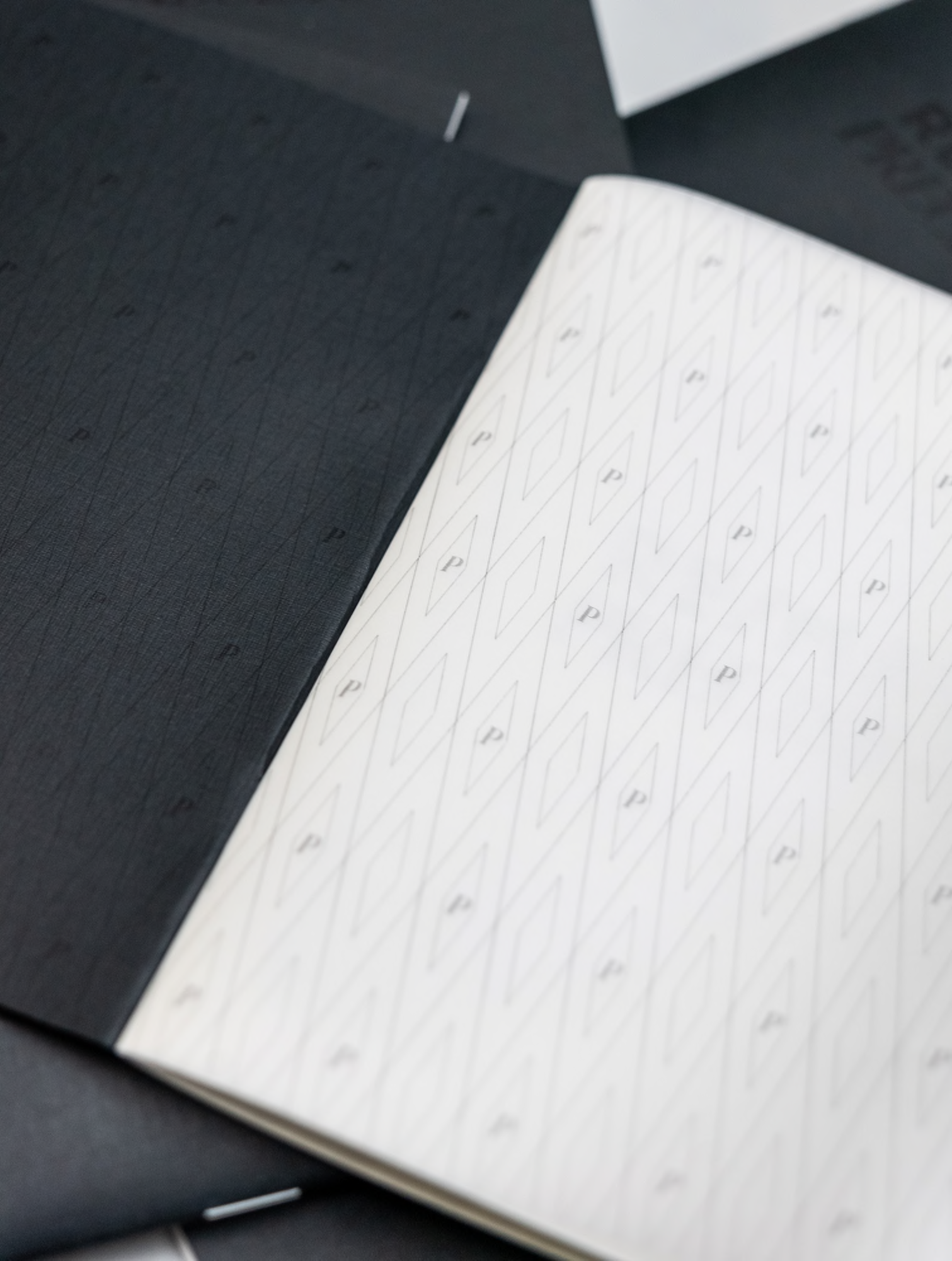
Prior to the rebranding effort, Precision utilized a basic stapled printer paper packet to present to potential recruits contemplating joining RE/MAX Precision. However, this approach failed to align with the prestigious and elevated image that Precision sought to convey. To rectify this discrepancy, I meticulously refined the content from the previous packet to reflect the new brand vision. Subsequently, I crafted a sophisticated booklet using premium materials, ensuring meticulous attention to detail to leave a lasting and positive first impression on the recipient.
Giveaway items
Agents often opt to switch brokerages based on positive recommendations from fellow Real Estate professionals or after engaging with recruiters representing brokerages at industry events. To capitalize on these networking opportunities, I design engaging giveaway items for Agent Mixers throughout the Des Moines area. These items not only serve practical purposes but also feature inserts that subtly highlight the benefits of considering a move to RE/MAX Precision, enticing Agents to explore the possibilities of joining our team.
Company events
By leveraging the new logo, color palette, and brand patterns, along with the elevated overall ambiance of the company, we maintain a sophisticated and professional appearance. Simultaneously, we strategically create numerous photo opportunities for our Agents, encouraging them to share our event assets and tag us on social media. This proactive approach aims to maximize our brand visibility, ensuring that Agents from various sectors of the industry will encounter and engage with our brand.