Summary
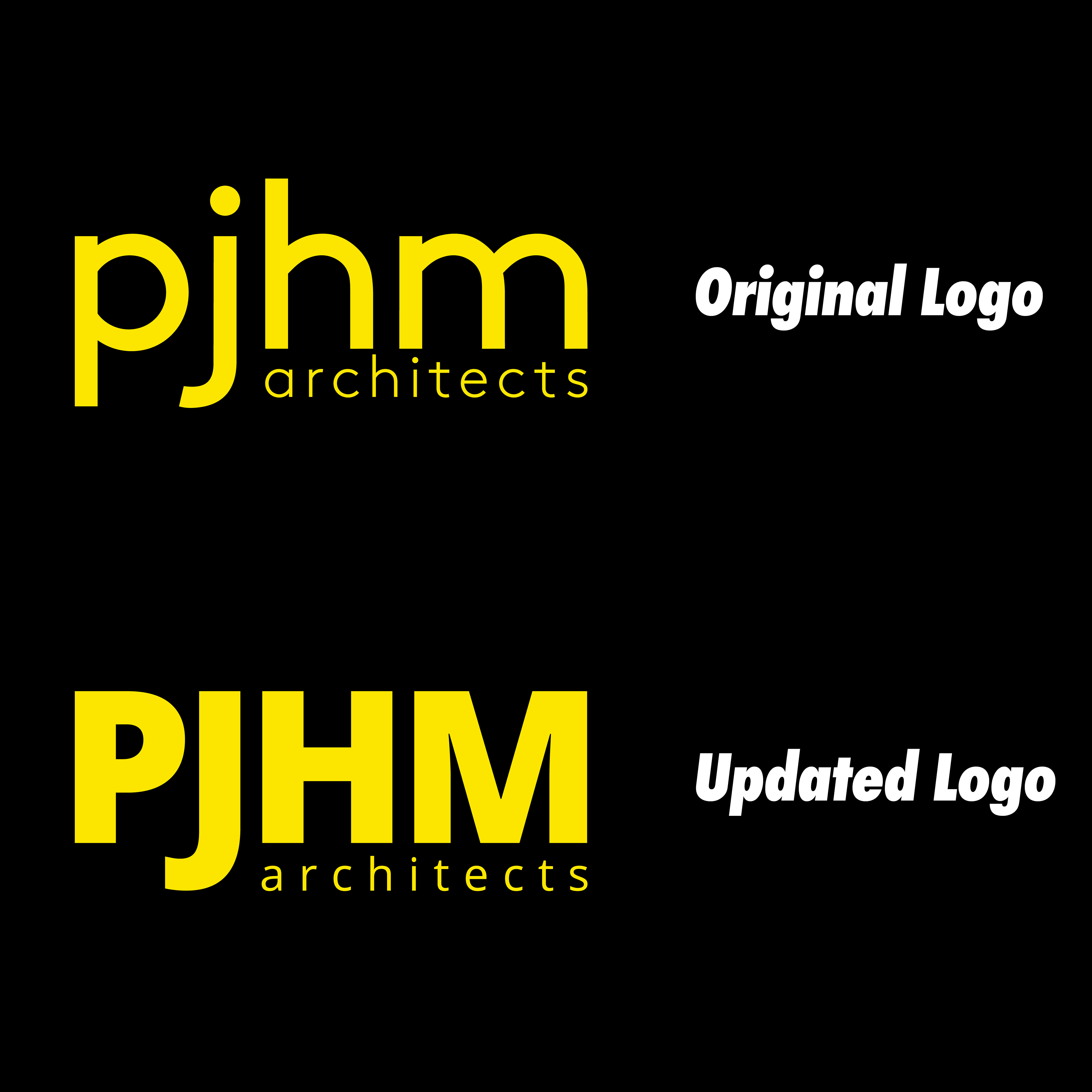
PJHM Architects undertook a strategic rebranding initiative aimed at revitalizing their visual identity to reflect their position as a leading School Architecture firm. With an outdated logo consisting of a lackluster font chosen years ago, PJHM sought a refresh that would infuse vibrancy and relevance into their brand. The absence of a defined color palette presented an opportunity to establish a cohesive visual language, with school bus yellow emerging as the signature "brand color" synonymous with their specialization. A key requirement was ensuring that the new branding seamlessly integrated with each school's identity, as PJHM frequently engaged in projects requiring unique Request For Proposals (RFP) documents. Through thoughtful design and strategic considerations, the revamped logo and branding elements now convey PJHM's commitment to excellence in educational architecture while accommodating the diverse needs of their clientele.
Key Objectives
Refresh Logo and Branding: Overhaul the outdated logo and branding elements to create a fresh, modern identity that aligns with PJHM Architects' position as a leading School Architecture firm.
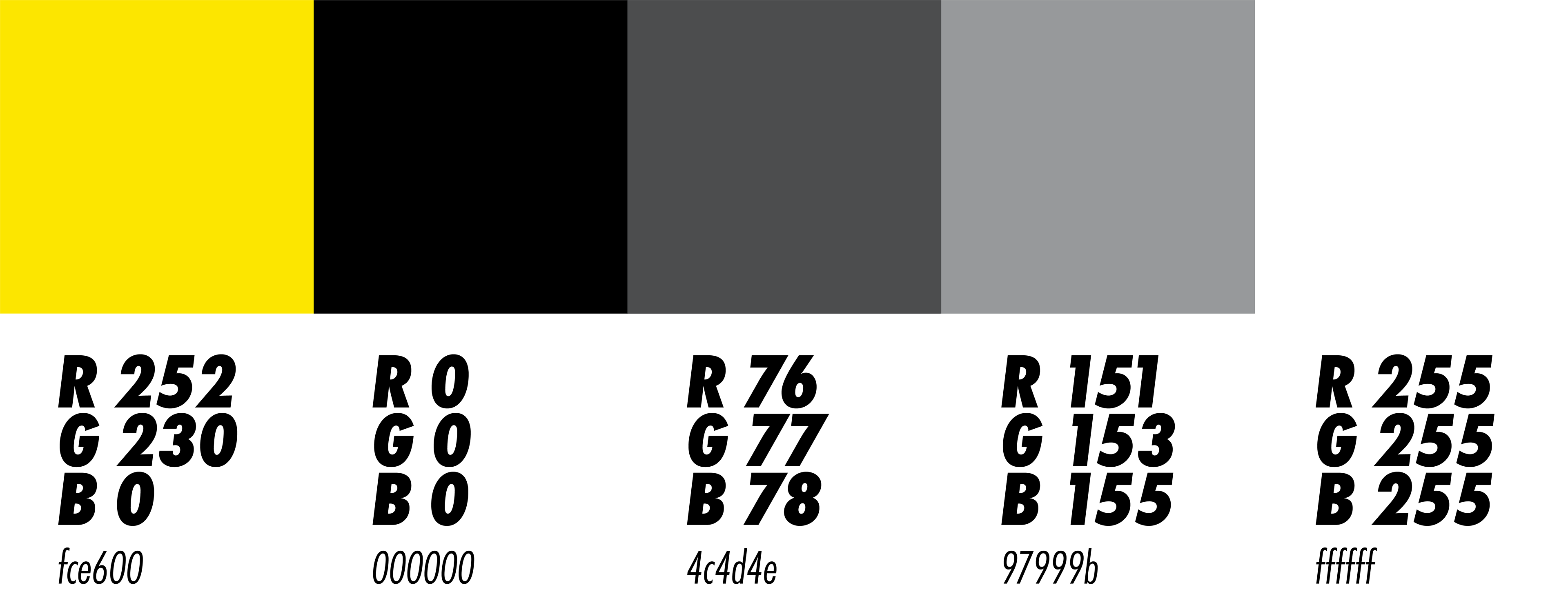
Establish Cohesive Color Palette: Develop a cohesive color palette that includes a distinct "brand color" of school bus yellow, reflecting PJHM's specialization in school architecture while maintaining visual consistency across all branding materials.
Integrate with School Identities: Ensure that the new branding seamlessly integrates with each school's identity, allowing PJHM Architects to adapt their visual language to accommodate the unique requirements of individual projects and Request For Proposals (RFP) documents.
Enhance Brand Recognition: Strengthen PJHM Architects' brand recognition within the educational architecture sector by creating a memorable and impactful visual identity that resonates with clients and stakeholders.
Communicate Excellence and Expertise: Communicate PJHM's commitment to excellence and expertise in educational architecture through the revamped logo and branding elements, establishing trust and credibility among current and potential clients.
Color rationale
Before the redesign, PJHM Architects Inc. did not have a straightforward & clear-cut brand identity. Part of my mission was to create a clear, recognizable, and functional color palette for PJHM Architects to use for their website, social media, and submittals. A simple greyscale color palette along with a pop of yellow was just what the company needed to get a cohesive look.
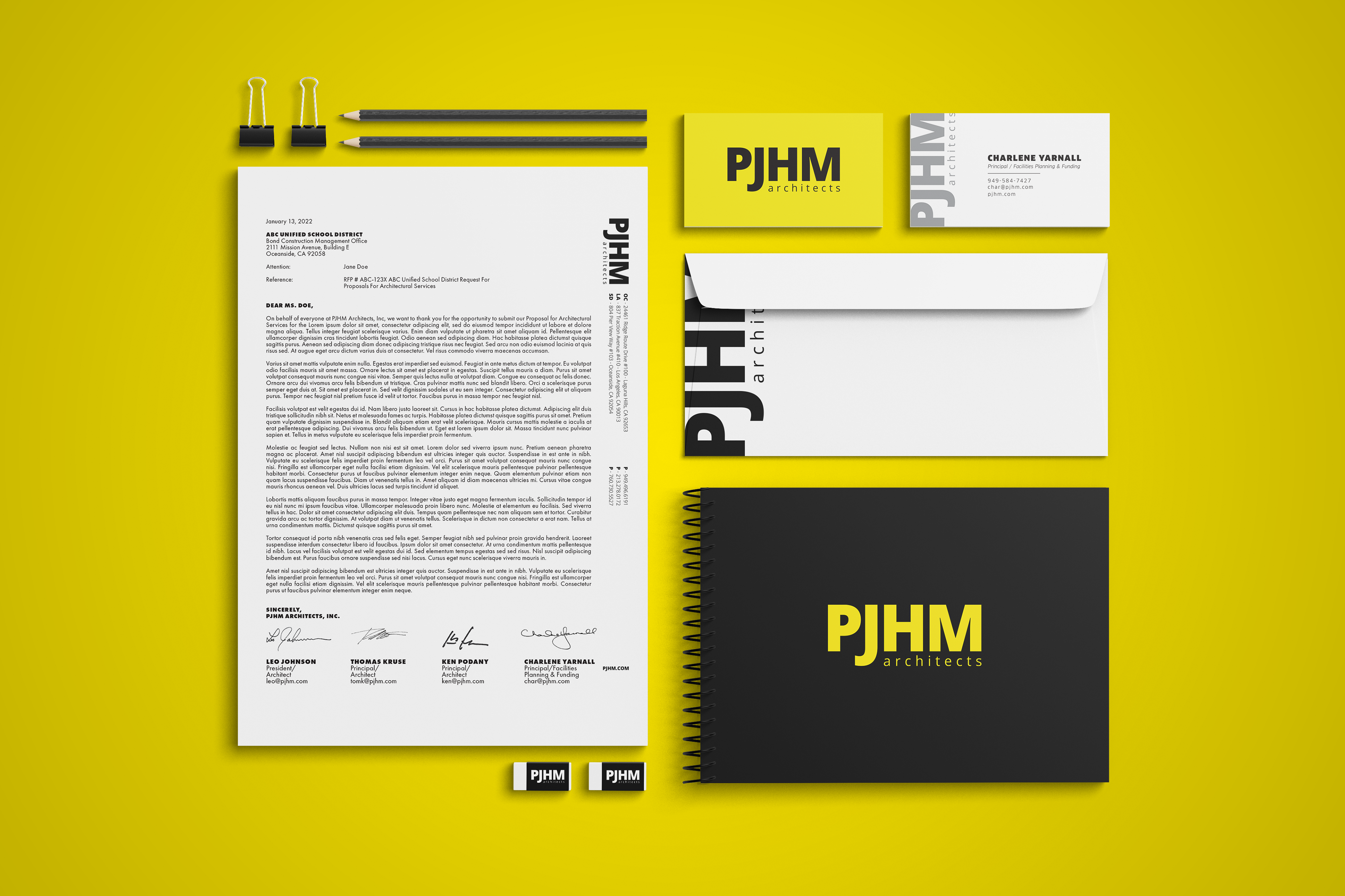
New logo in use

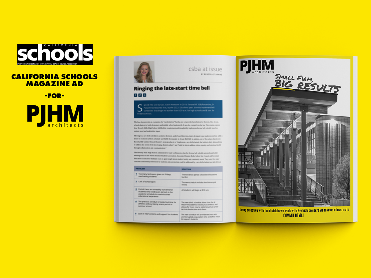
Advertisements
PJHM typically limits its marketing efforts to the submission of qualifications due to the nature of their industry, focusing primarily on California School Districts. However, while they may not engage in extensive marketing, they want their clients to understand one key message: they are a small firm that highly values every district and project they undertake. PJHM's size allows them to provide personalized attention to each client, demonstrating a dedicated commitment to excellence in every project they undertake.
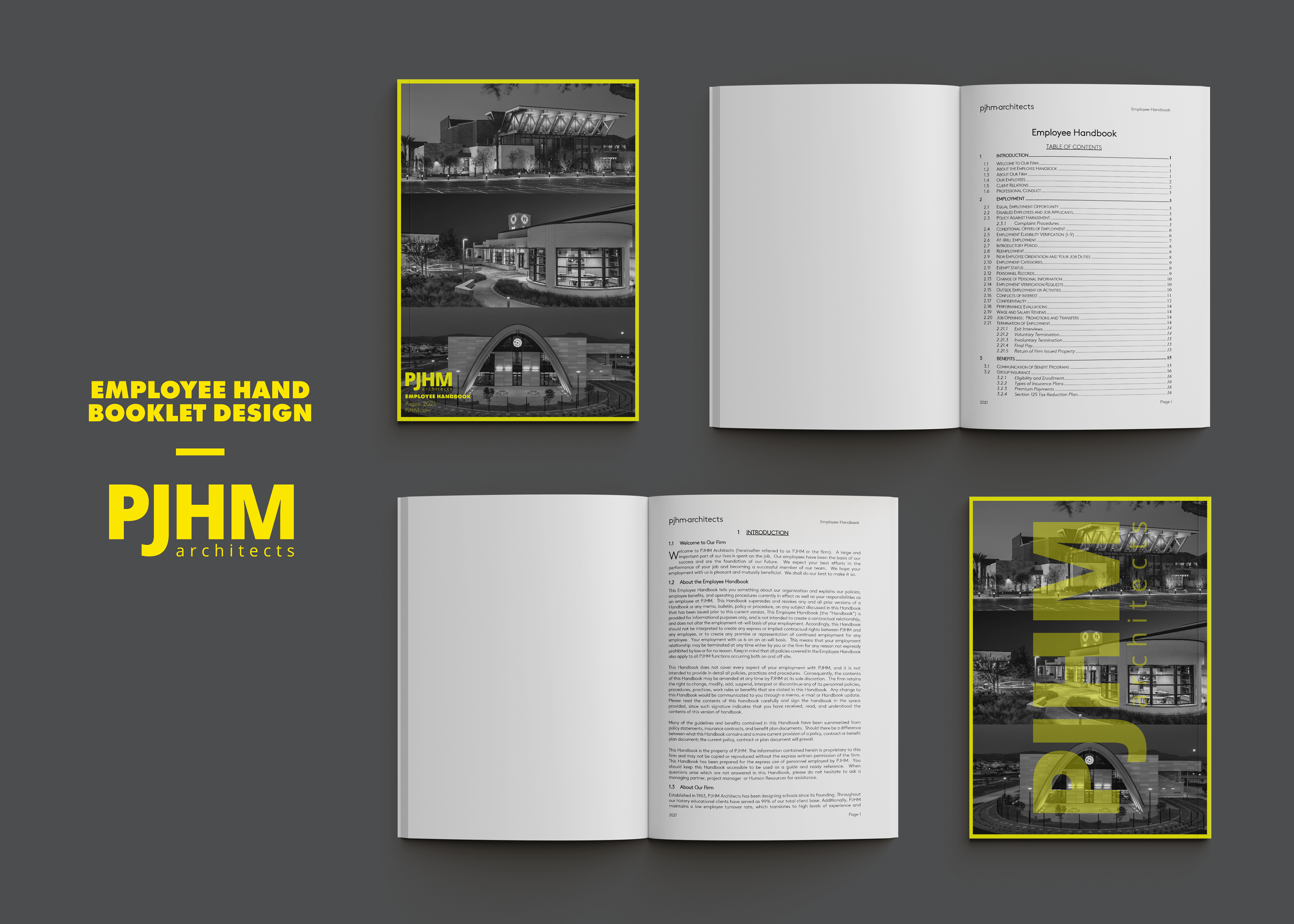
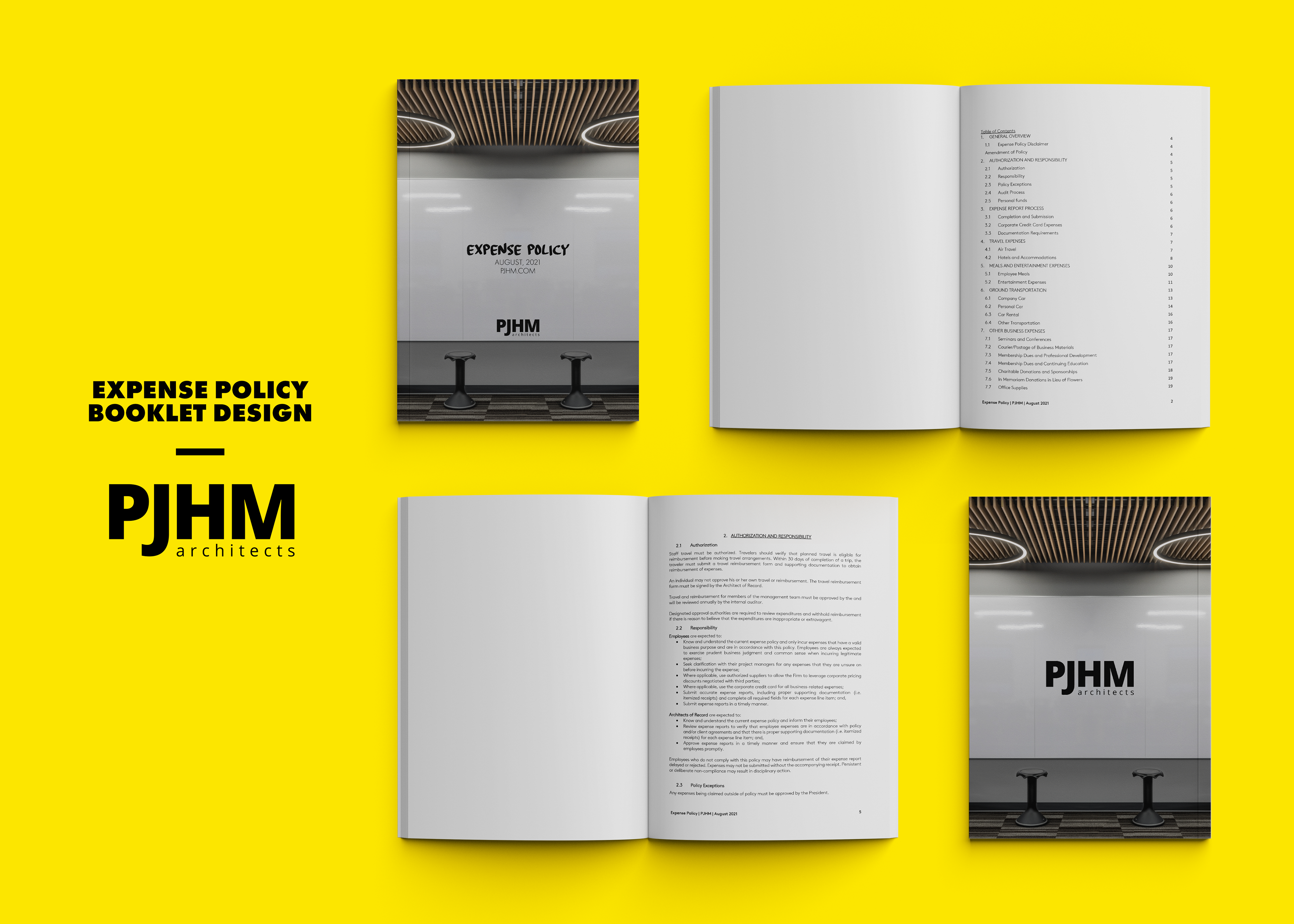
Office files using the new branding
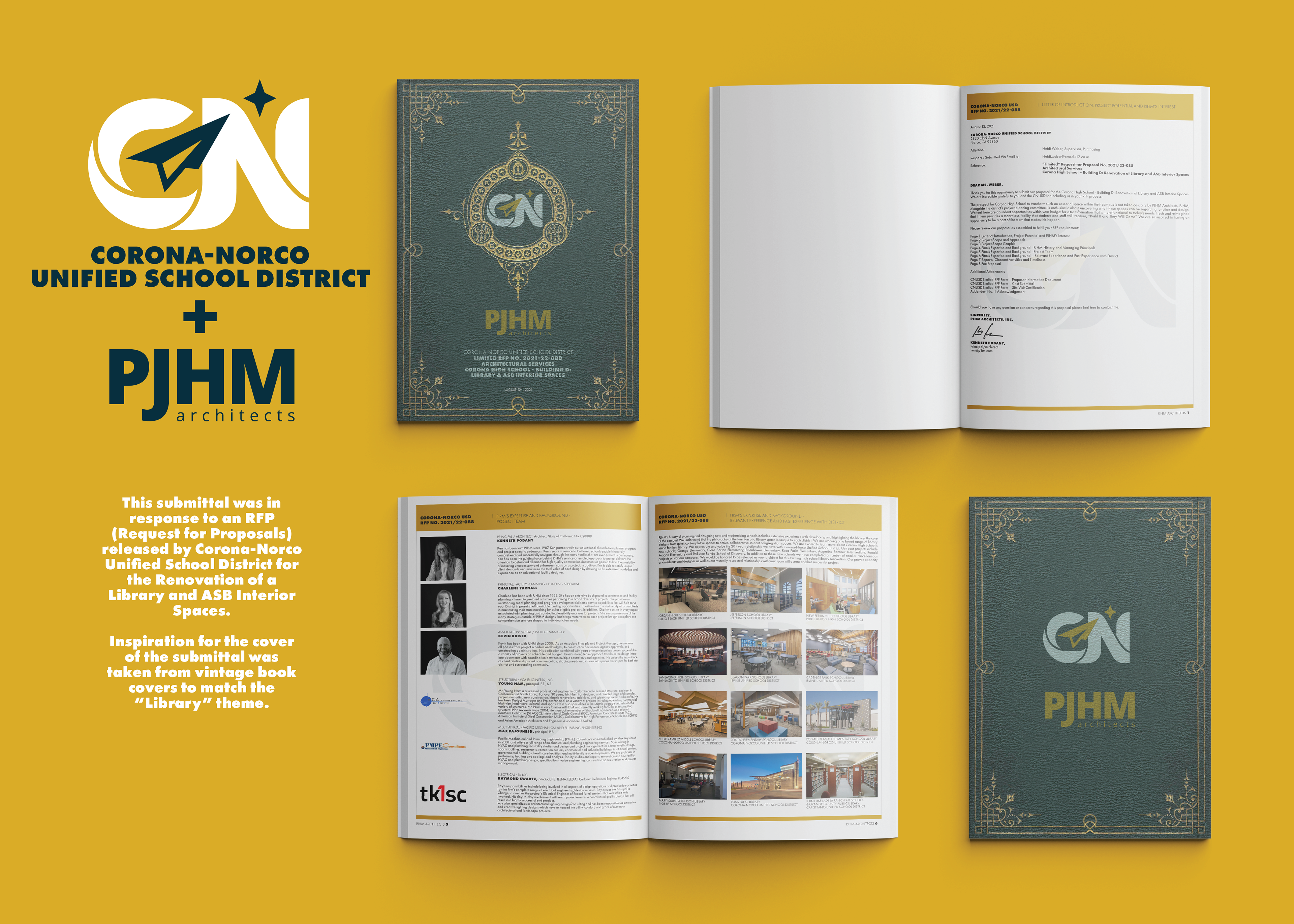
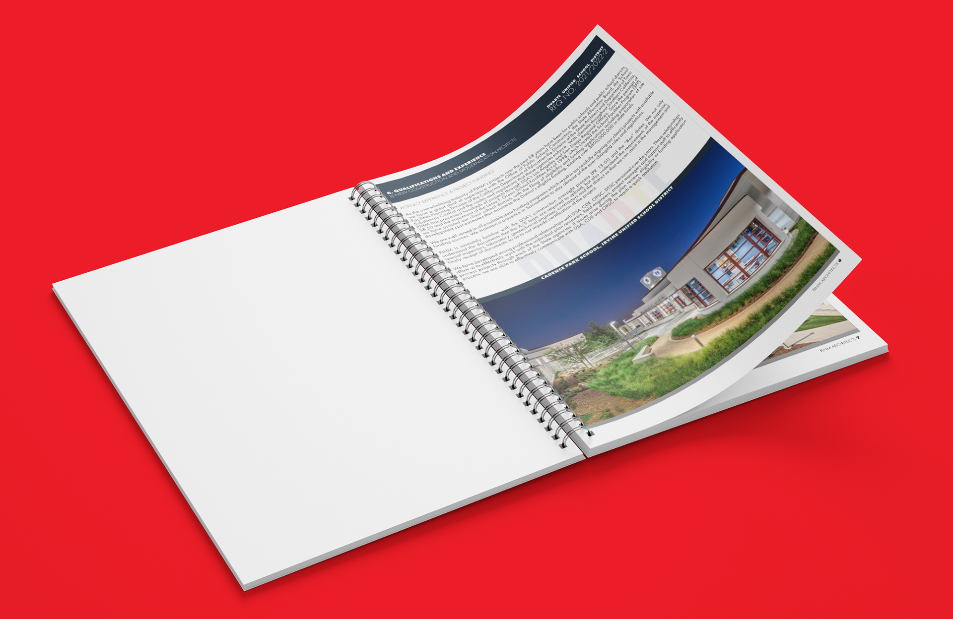
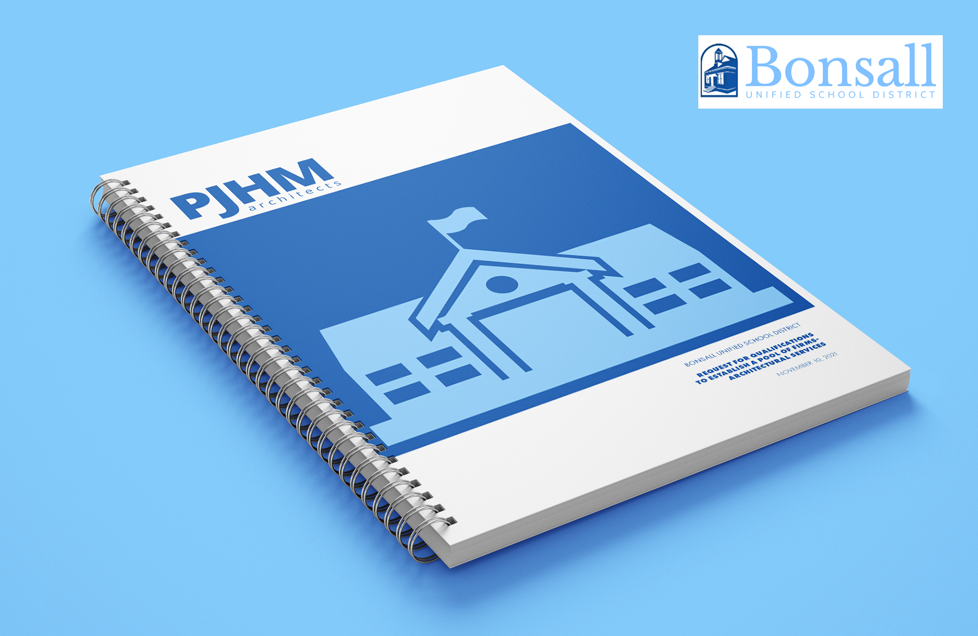
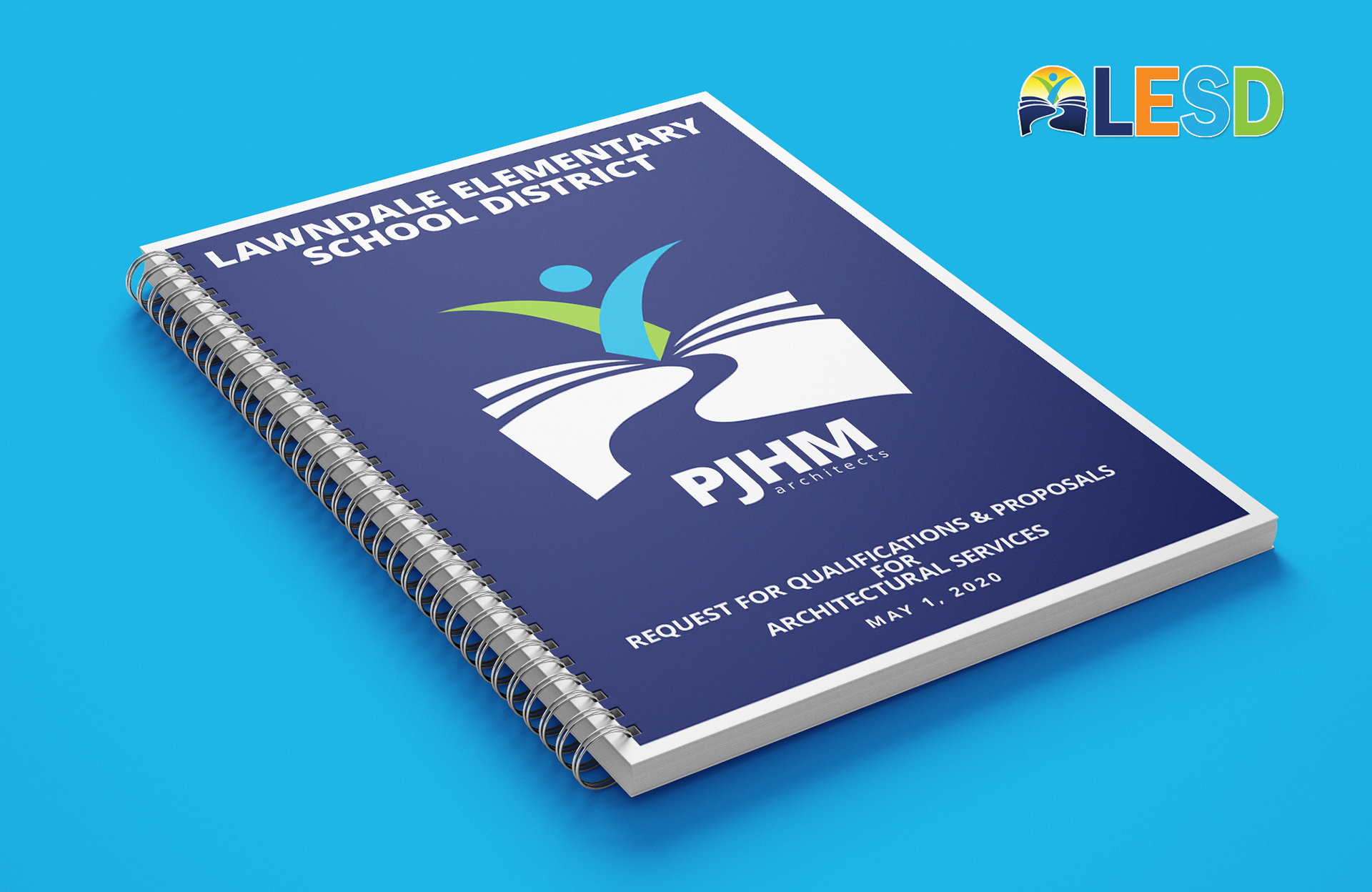
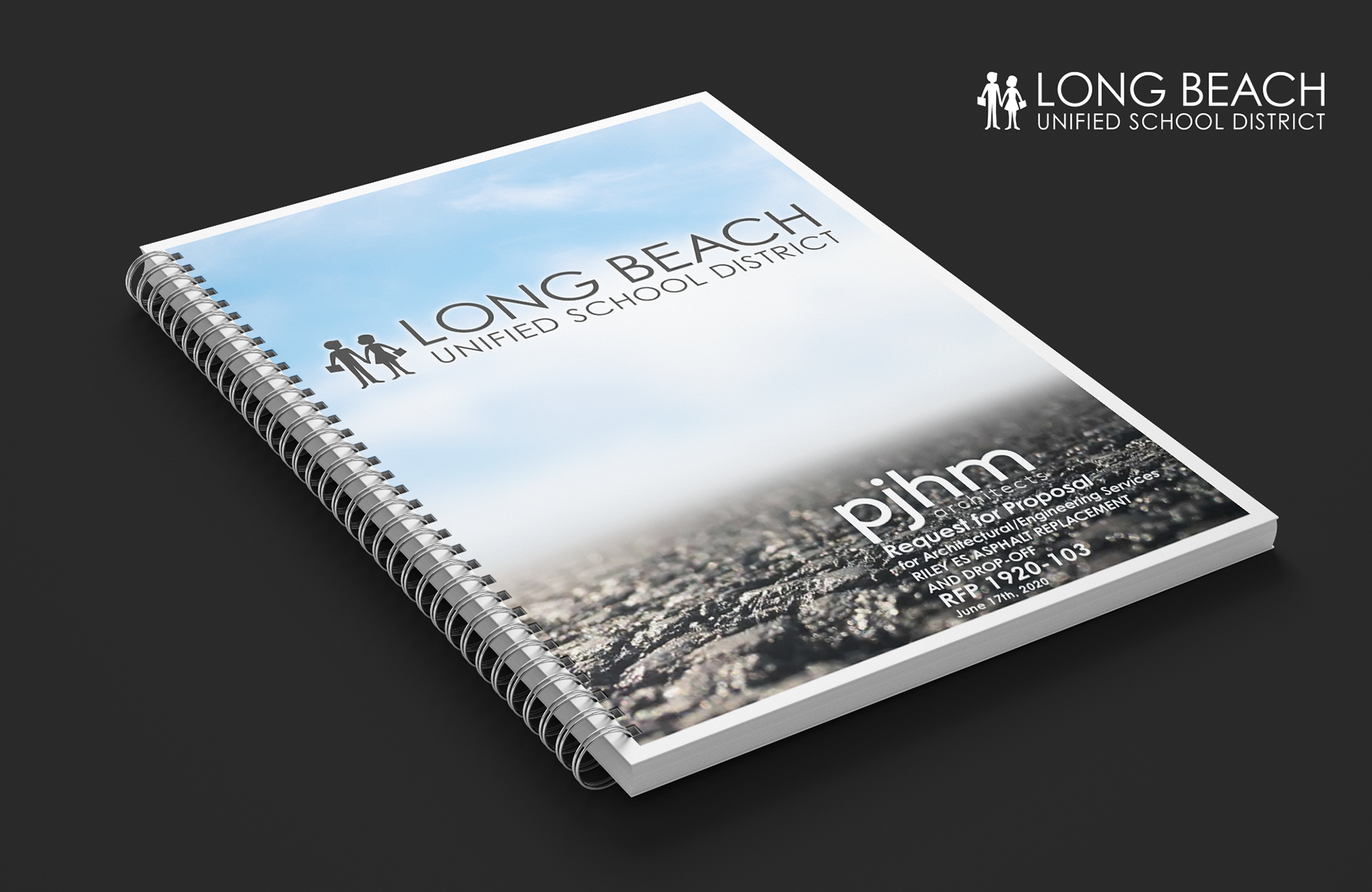
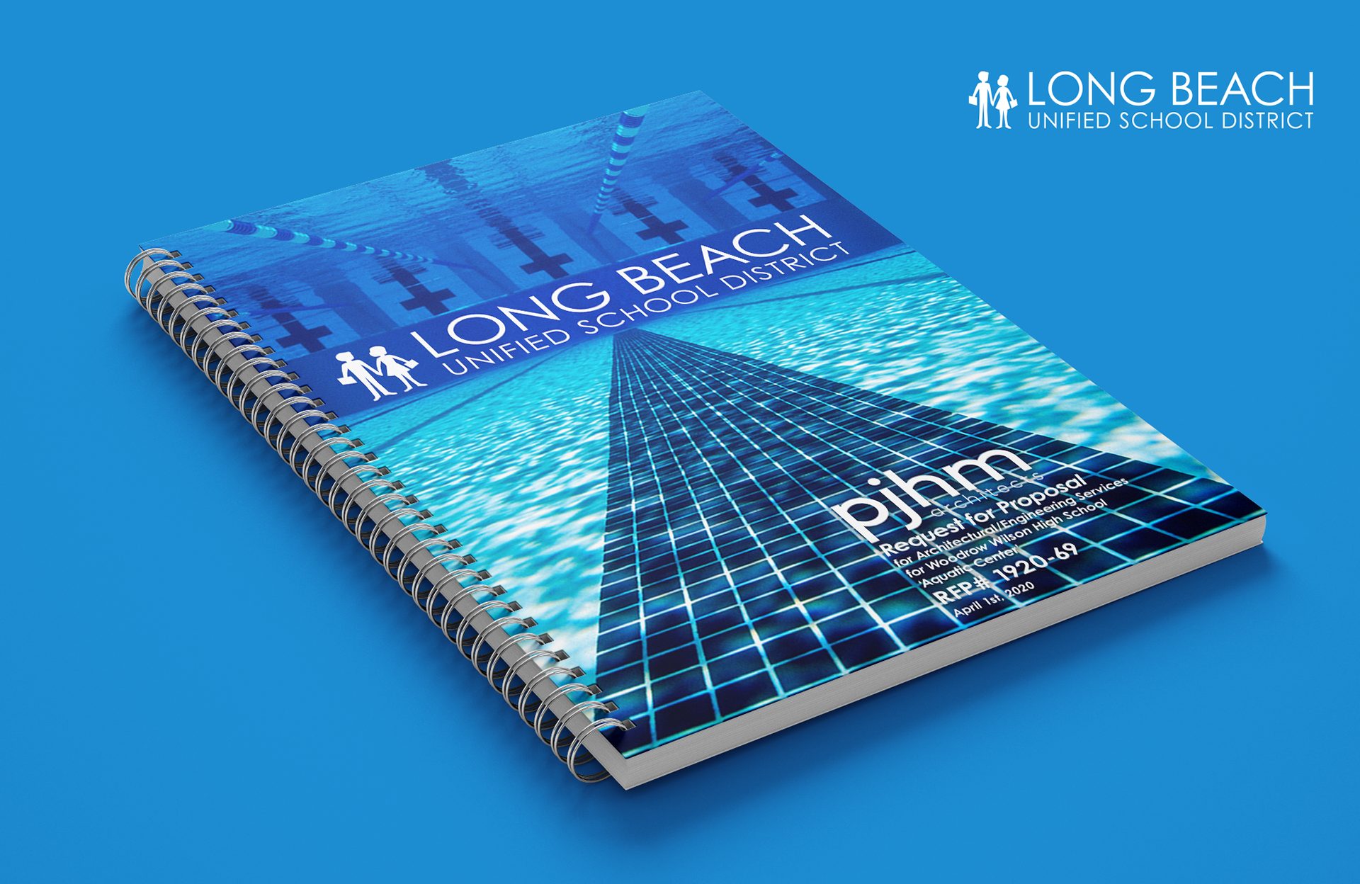
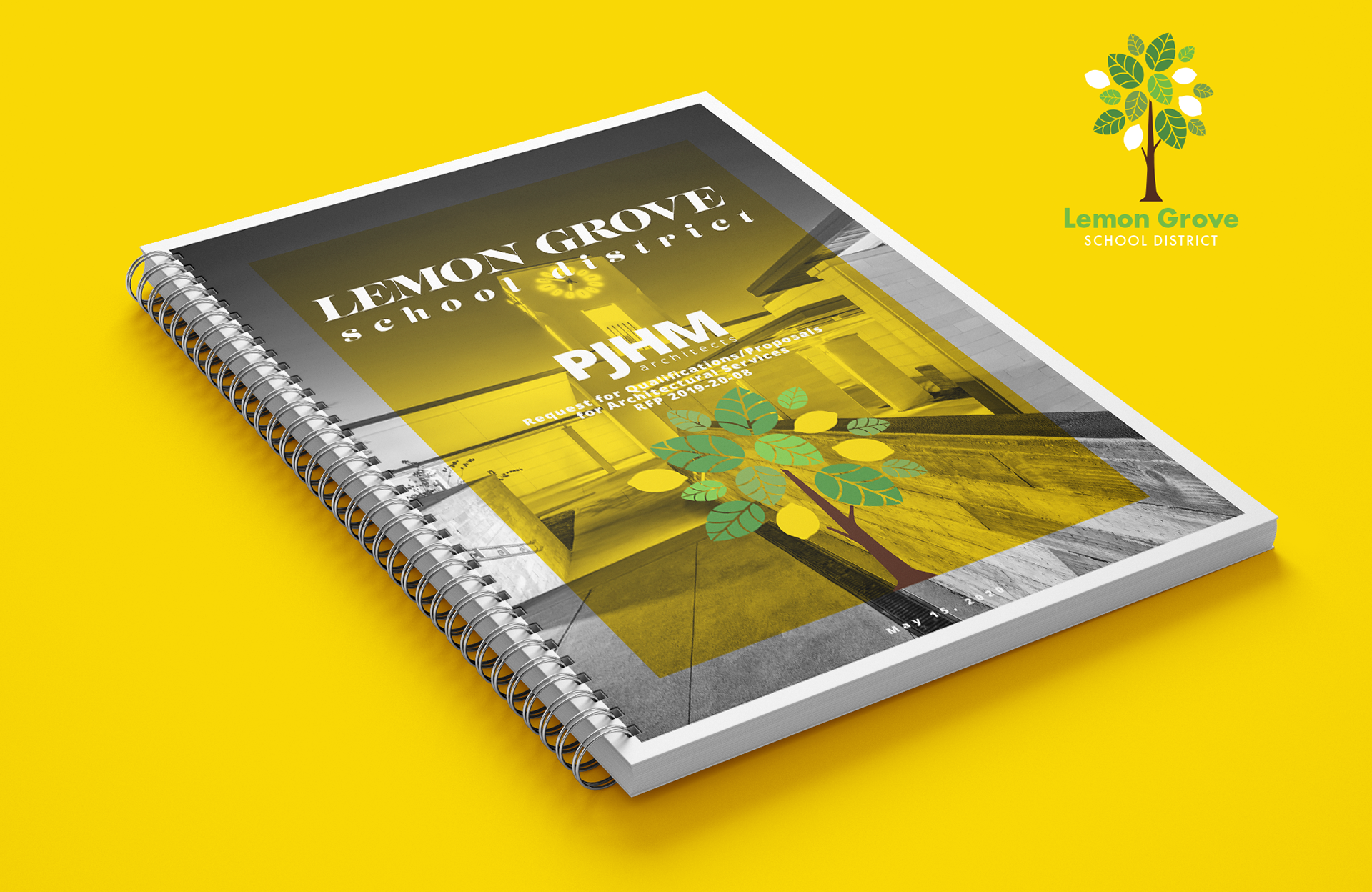
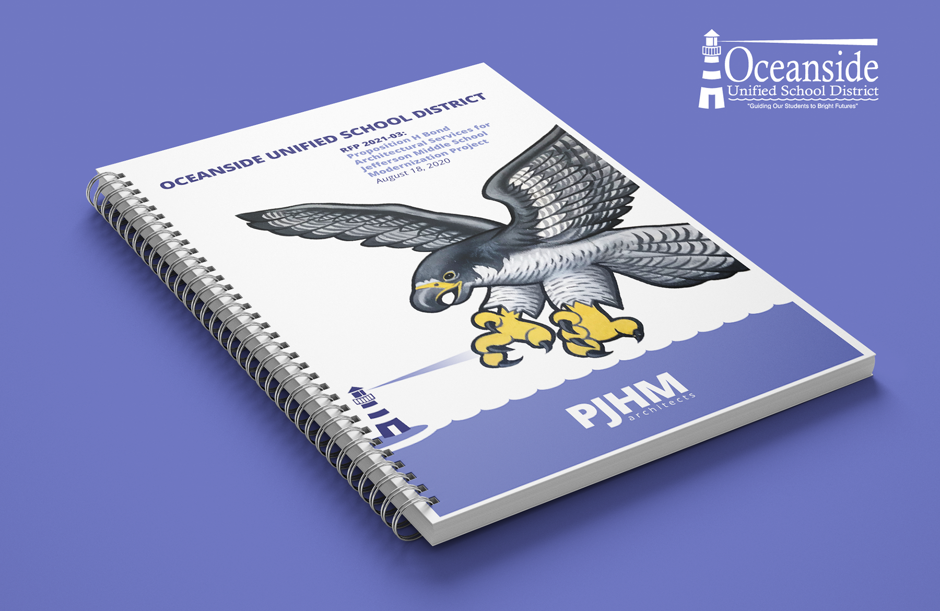
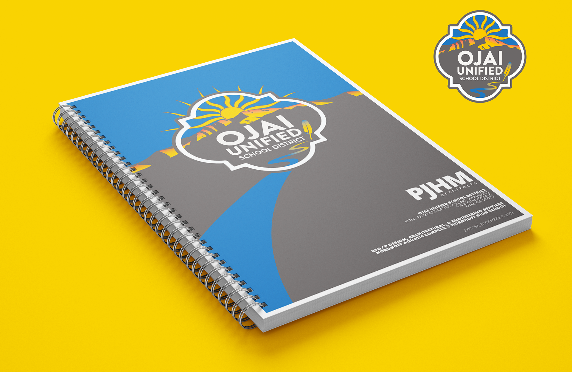
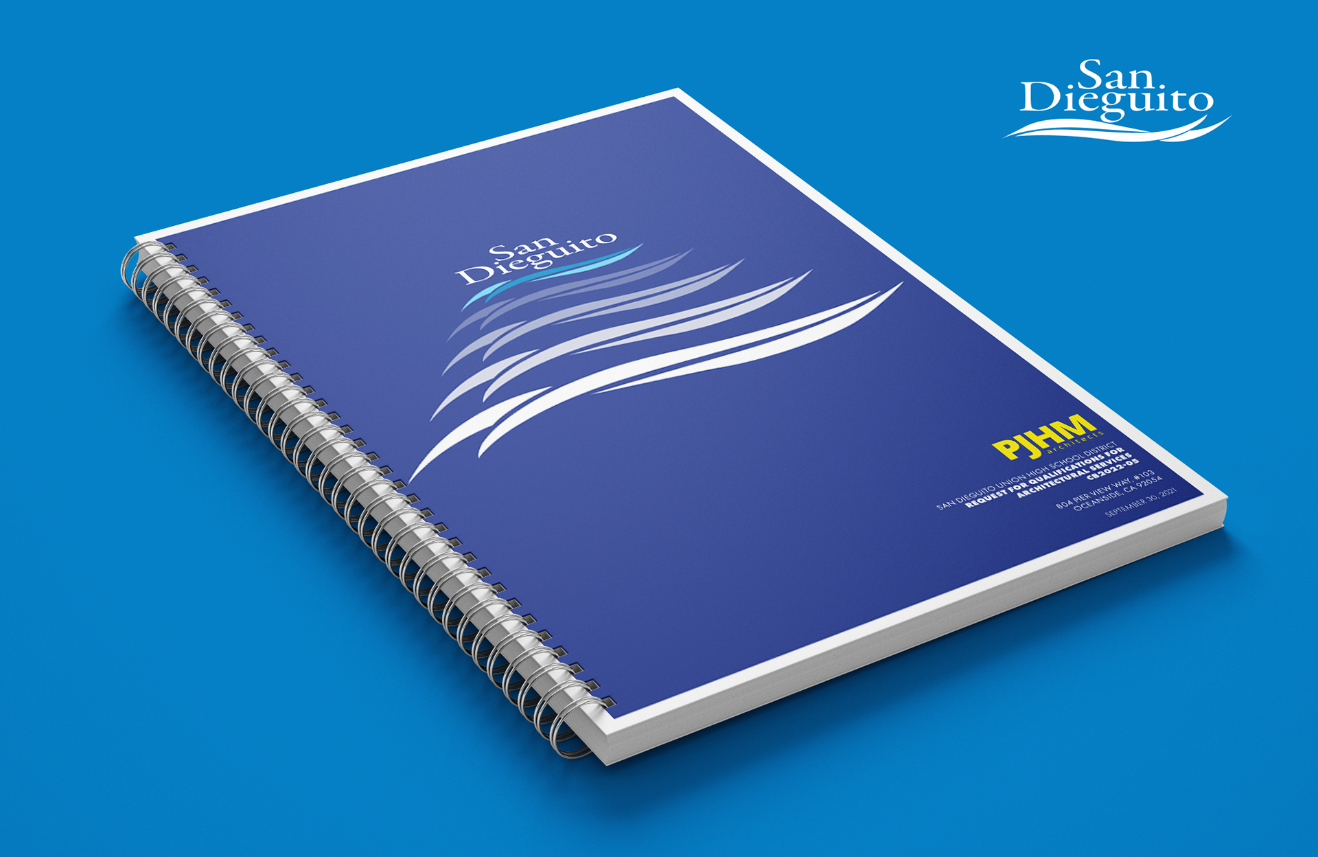
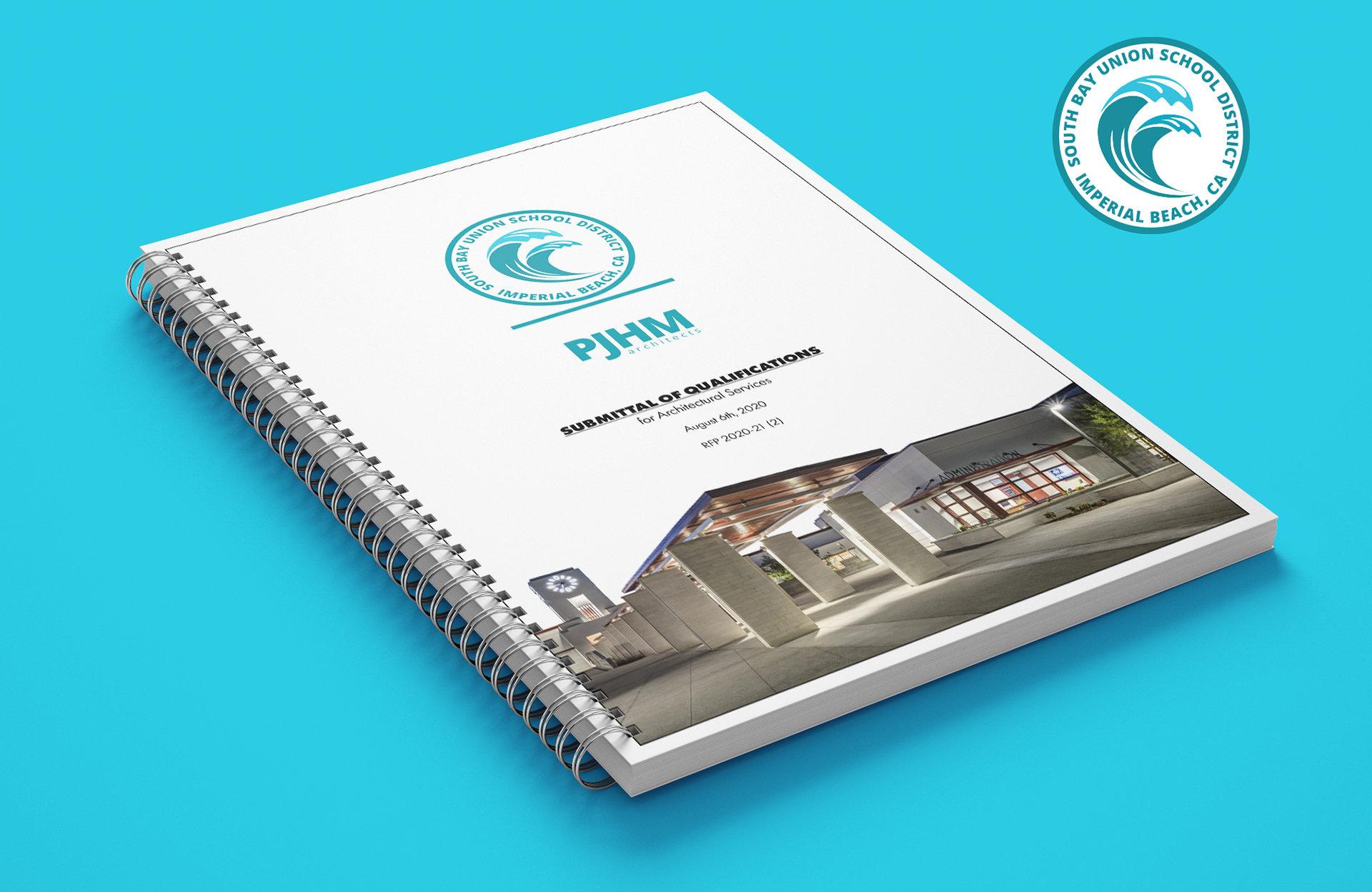
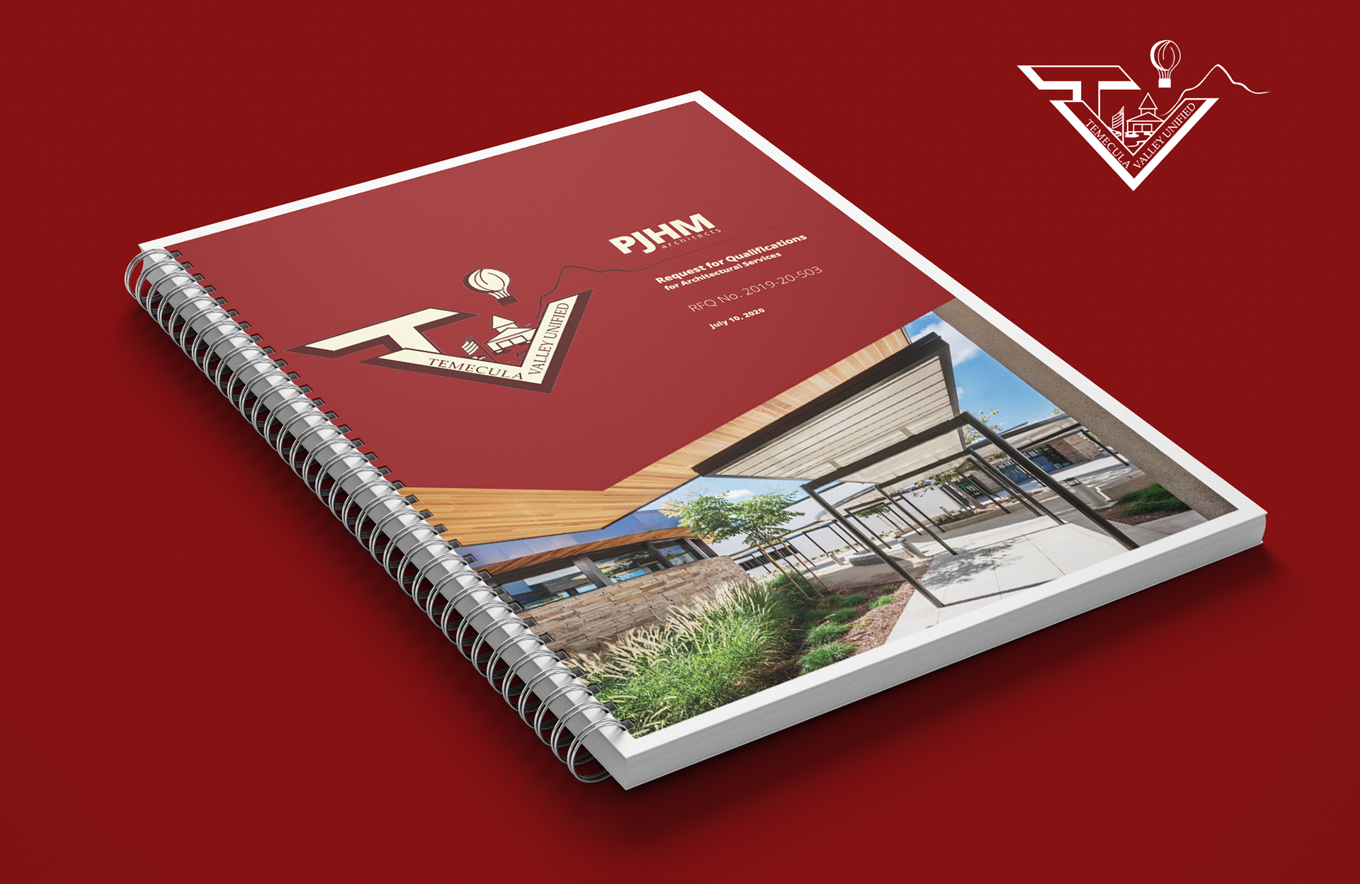
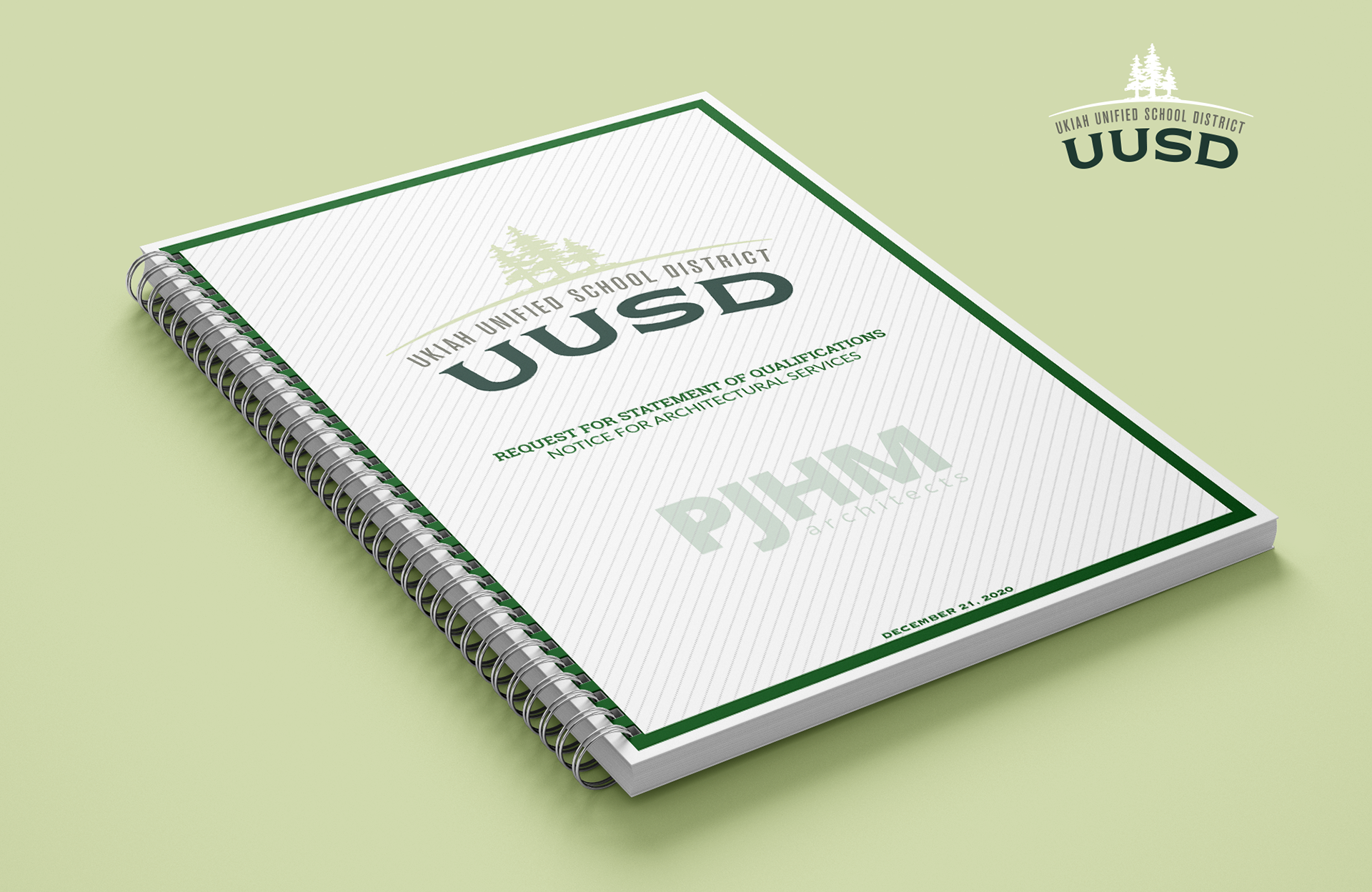
EXAMPLES OF SUBMITTALS
School districts would issue Requests for Proposals (RFPs) or Requests for Qualifications (RFQs), soliciting architectural firms to demonstrate their capability and suitability for specific projects. My responsibility was to compile PJHM's images of past projects, procure the correct copy for each requested section, and ensure that the submission adhered to the specific guidelines outlined in each RFQ. Additionally, I ensured that the proposal aligned with the unique brand identity of each school district. From initial concept to final printing, I managed the entire submission process, ensuring a seamless journey from start to finish.